For some people, dark mode is aesthetically more pleasing. On the other hand, there's a group of people (including me) that likes to read at night under dim lighting, or even in total darkness. Having the option to use dark theme reduces strain in the eyes and makes it more pleasant to read at. I personally doesn't care that much about the aesthetic aspect of the dark mode. I think of it as an accessibility feature.
Granted, reading white text in dark background is a worse experience than reading dark text in light background. But you know what's worse? Opening a site at night that blast you with a very bright background.
I've visited few of those sites, I ended up closing them and stop reading. I don't think I returned the next morning. This is why I try my best to make sure dark mode experience in my own site delightful.
note
I don't work in UX and have no UX background. All guides and suggestions here are purely based on my biased personal opinion. If you think there's something I should know let me know on Twitter.
Theme Preference
All major browsers have supported dark mode (to a degree). It's easier than ever to add dark mode support to websites. The process itself is pretty straightforward1. You add a meta tag that tells the browser that your site works in both light and dark environment.
<meta name="color-scheme" content="light dark" />By using this meta tag, all default styling that comes from the browser will be adjusted based on system preferences. If you prefer dark as default color, you can reverse the value to be dark light.
In my observation, Safari does this best because it also handles form input (text field, radio, etc) as well, unlike Chromium-based browsers. I also prefer the color selection in Safari more. Firefox is the worst because it doesn't do anything.
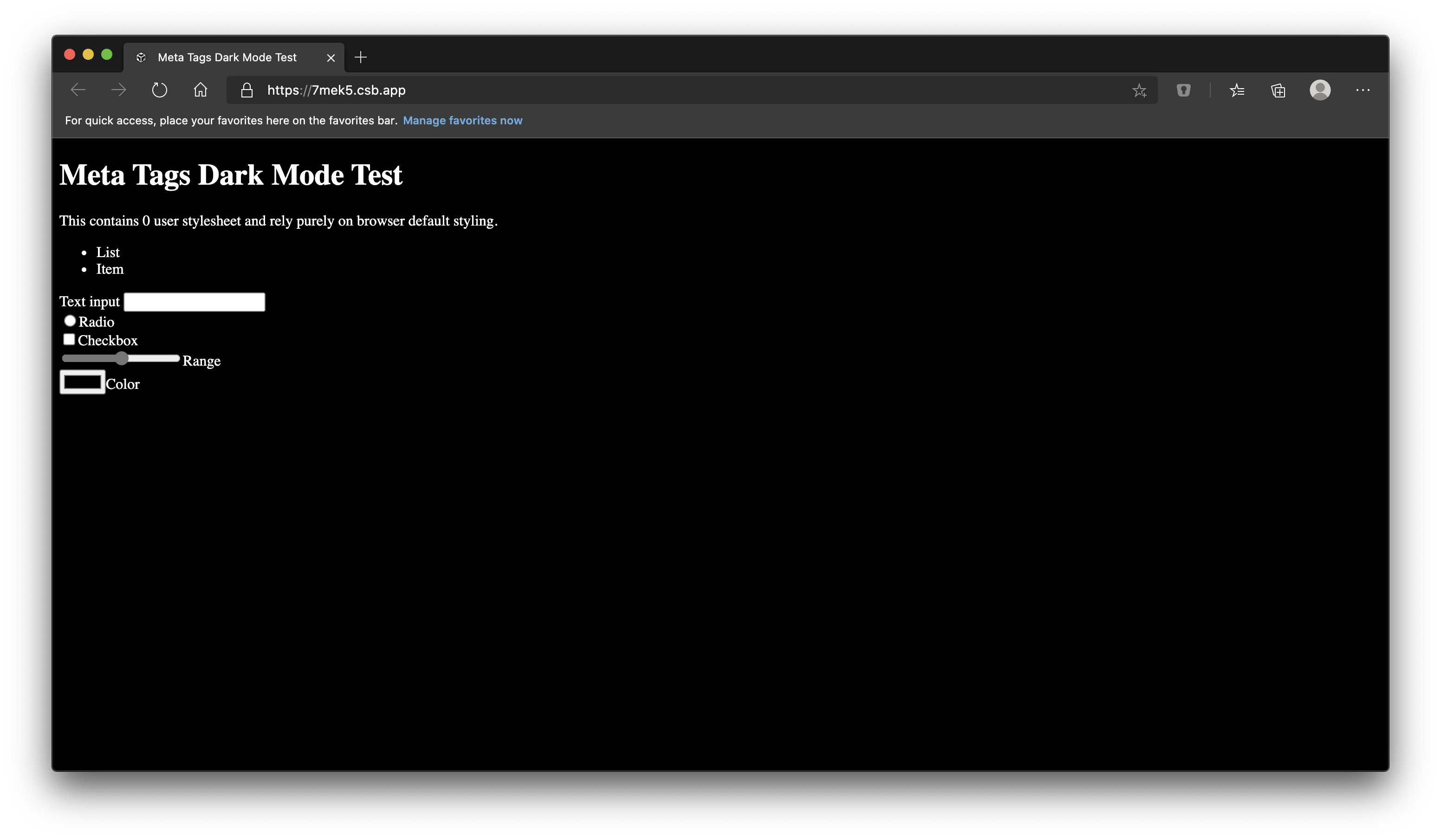
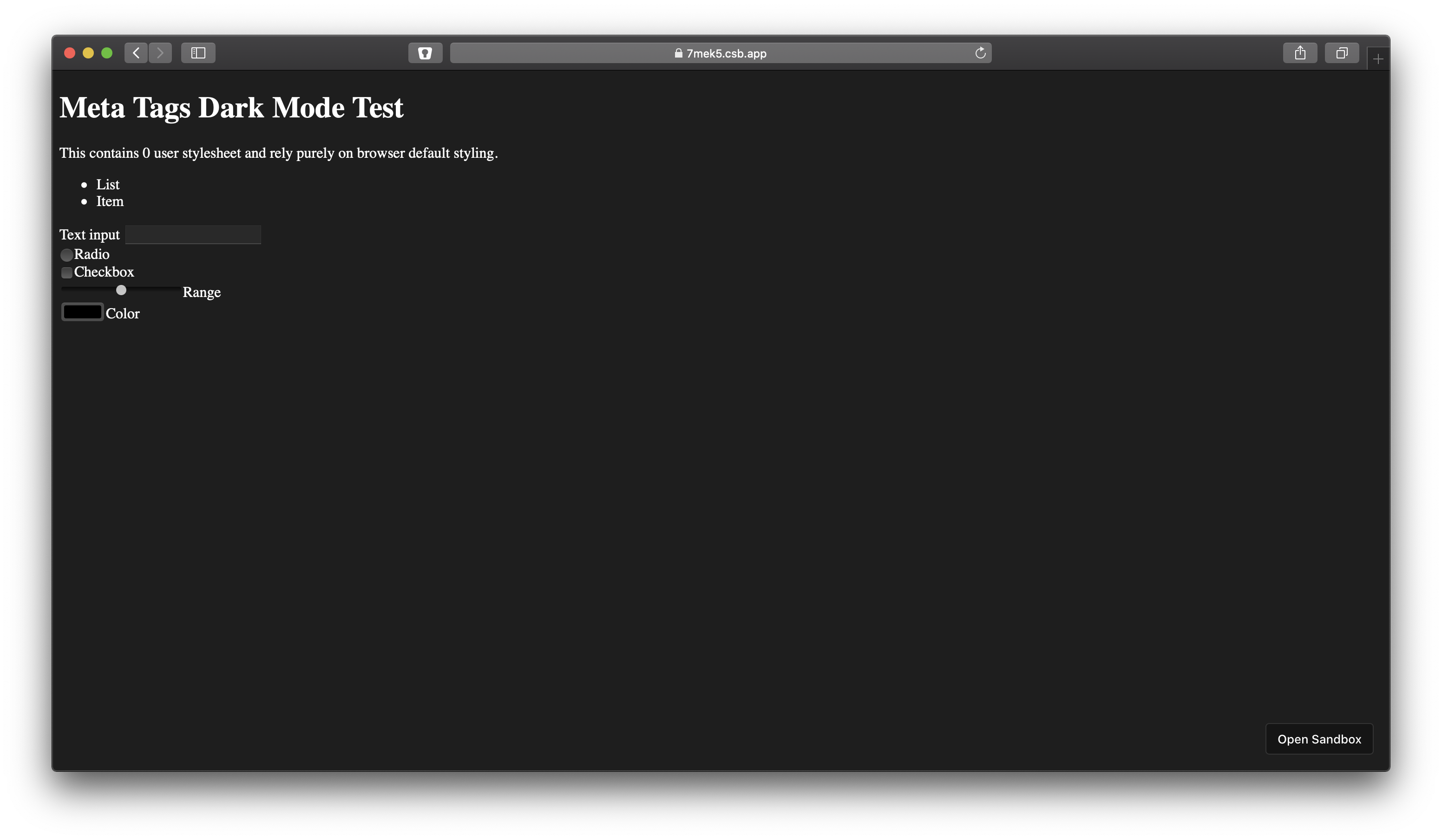
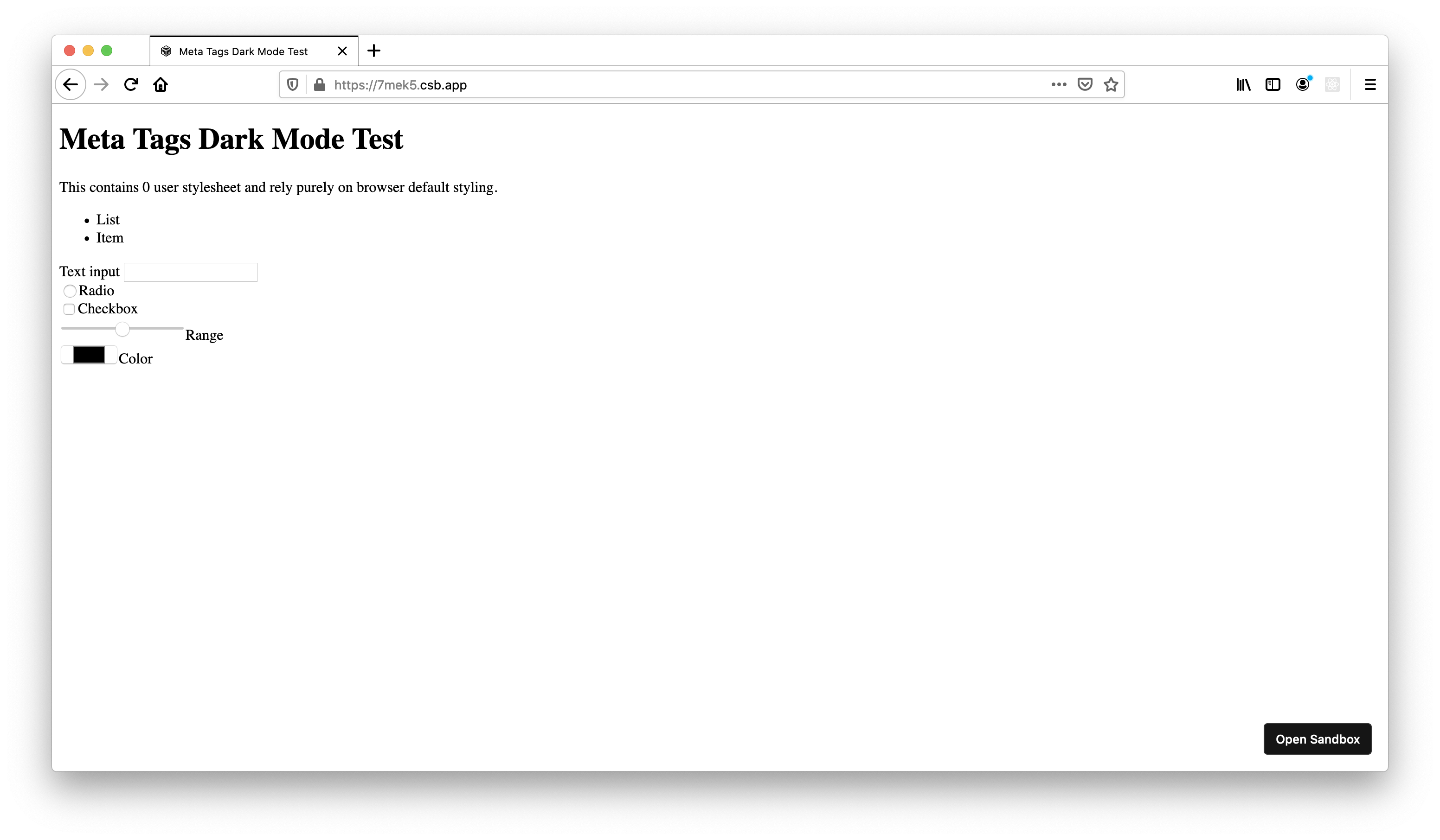
color-scheme meta tag in dark mode setting. From left to right (top to bottom on mobile): Chromium, Safari, Firefox. CodeSandbox linkIn addition to the meta tag, you can add prefers-color-scheme media query to set your own colors.
body { color: #000; background-color: #fff;}@media (prefers-color-scheme: dark) { body { color: #fff; background-color: #000; }}When using JavaScript, you can use window.matchMedia method to detect browser support:
const media = window .matchMedia ('prefers-color-scheme');if (media .media !== 'not all') { // supported}You should always respect system preference unless they explicitly choose specific theme. The only time you can force default theme to either light or dark, is if the browser doesn’t support dark mode.
If it's not supported, you can use whatever default theme you want. You could get creative and set the default based on the user time, like sunrise/sunset. However, you should never ignore system preference. It's there for a reason.
Default theme should always refer to system theme, if available.
User Preference
Respecting system preference is a good first step. It's even better if you give user control to change the theme themselves. This can be implemented using toggle, switch, select, or any design elements depending what kind of options you provide.
I'm using select to allow user to reset their theme back to system preference (if they wish to do so) in addition to set it always light/dark. This works reasonably well in desktop, tablet (iPad), and mobile phones. I also don't have to think about the selection UI which is another win.
Considering some operating systems now have automatic dark mode setting, having an option to reset the preferences back to system allows user to try the different theme and revert back to system afterwards.
It's not a requirement. It's about giving a choice.
Flash of Default Theme (FODT)
If you simply provide dark mode toggle, user might experience what you call Flash of Default Theme (or FODT for short). This typically happen when user's selected theme preference is in conflict with their system preference. For example: system preference is dark, yet they chose light theme in the site, or vice versa.
It look like this:
What actually happen is the JavaScript file(s) that detect user preference and switch the theme in runtime is executed after browser finished rendering. This causes the browser to repaint the page two times. First, before the JS is executed, and the 2nd one is after. This can happen when you're writing the preference selector logic inside your UI framework, which usually bundled and served as async/deferred script tag.
We've gotten used to placing JS before the end of closing body tag with async/defer attribute, we forget that having blocking JS is not always a wrong thing. With blocking JS, the browser will stop rendering the page until our JS is executed. By taking advantage of this behavior, we can set the runtime color values according to user preferences before rendering happen.
<html> <head> <script type="text/javascript"> try { const preference = localStorage.getItem('theme-pref'); if (preference) { document.documentElement.setAttribute('data-theme', preference) } } catch (err) { // do nothing } </script> </head> <body> <div id="app"></div> <script defer src="/chunk.js"></script></html>Here we're adding data-theme attribute to the html element and we let CSS takes care of the rest. We'll see later why we're using data attribute to mark the user preference.
When using React (like me), this means you have to use dangerouslySetInnerHTML and pass the code string.
The downside when you inline the code string is you lost syntax highlighting and lint issue in your editor/tooling. You can store the code somewhere with a JS extension (like normal file), and importing them inline in build time.
tip
Use raw-loader if you're using webpack, or raw.macro that leverages babel-plugin-macros to include snippet at build time.
Because you're importing the module as a raw string, you should only includes valid JS that works in all browser. This means no TypeScript, no import, and no require.
import React from 'react';import { Main, NextScript } from 'next/document';import raw from 'raw.macro';export default function Document() { return ( <html> <head> <script dangerouslySetInnerHTML={{ __html: raw('./antiFODT.js') }} /> <link rel="stylesheet" type="text/css" href="/style.css" /> </head> <body> <Main /> <NextScript /> </body> </html> );}This way your JS tooling like linter and code formatter still works.
CSS Variable vs React Context
If you use React and you need to add dark/light mode support to your components, the first thing that came in your mind probably was to use React Context. After all it's a great mechanism to propagate values deep in the tree. Unfortunately, using React context or any typical JS-only theming solution hurts performance (and subsequently UX) because we need to wait rendering the component or we'll have FODT.
Supporting user preference, using React context and SSR is just incompatible. Doing server-side rendering means you have to know in advance what the user preference is, which is impossible2.
I'm happy to say that my dark mode implementation contains single hooks and uses zero React context.
Here's I did it:
The first thing to note is that all color references in JavaScript can be replaced with CSS variables, even when using CSS-in-JS. Rather than using theme context and JavaScript, we refer the value directly using CSS variables.
This means, instead of writing code like this:
// styled APIconst SidebarStyled = styled .aside ` color: ${props => props .theme .color .darkPrimary };`;// or CSS prop and inline styleconst SidebarCSS = () => { const theme = useTheme (); return <aside css ={{ color : theme .color .darkPrimary }} />;};We write code like this:
// styled APIconst SidebarStyled = styled .aside ` color: var(--color-dark-primary);`;// or CSS prop and inline styleconst SidebarCSS = () => { return <aside css ={{ color : 'var(--color-dark-primary)' }} />;};By changing the style declaration from dynamic value based on context to a static one, we don't waste resource re-rendering all components just because the theme changes.
This works well, though it still has downside as well.
Strongly-typed CSS variables
If you're used to TypeScript, you might think the 2nd solution is worse. You can't check the theme values at compile time. There's no error message and your layout suddenly breaks. Using CSS variable doesn't guarantee correct theme usage. It's easy to accidentally refer the wrong value due to typo (especially if you're using butterfly keyboard 😉).
To solve this, I created a small utility to write type-safe CSS variable using typescript called theme-in-css. With this module, I can define all my theme values in TypeScript and use it as CSS variables.
import { createTheme } from 'theme-in-css';export const theme = createTheme ({ color : { darkPrimary : '#000', },});The example above then becomes:
import styled from 'styled-components';import { theme } from './theme';// styled APIconst SidebarStyled = styled .aside ` color: ${theme .color .darkPrimary };`;// or CSS prop and inline styleconst SidebarCSS = () => { return <aside css ={{ color : theme .color .darkPrimary }} />;};Now, we get the best of both worlds.
Components that uses theme value don't need to be re-rendered just because the theme changes. Only a few components that really depends on the theme preference do (like the toggle button).
The last step is to add all the CSS properties in the global style.
import { createGlobalStyle } from 'styled-components';import { theme , darkTheme } from './theme';const GlobalStyle = createGlobalStyle ` :root { ${theme .css .string } } [data-theme="dark"] { ${darkTheme .css .string } } @media (prefers-color-scheme: dark) { :root:not([data-theme]) { ${darkTheme .css .string } } }`;First, we decide our default theme (in this case light) and set all custom properties in :root selector. Then, we add style override using data-theme attribute selector for dark mode from user preferences. Finally, we add media query to match dark mode from system preference, but only if user doesn't explicitly chose any theme.
Remember data-theme earlier? This is why we set them inside blocking JS. When browser starts rendering the page and style rules are computed, it will use the correct values.
Contextless Hooks
Using CSS already covers majority of use case for styling, yet we also need another mechanism to share current theme value inside JS. Technically, it's fine to use React context. But there's also a way to not use context and still share the value across different component in the tree.
First thing I did was list all the values that needed to share. I came up with three: current theme (dark / light), user preference (dark / light / system), and a setter function.
Current theme is technically a computed value based on user preference. It's so commonly used compared to the other two, I decided to extract them into different value and put them in the first element of the tuple.
Here's the full API:
const [theme , preference , setPreference ] = useDarkMode ();Most of the time, I only need the theme value:
function Component () { const [theme ] = useDarkMode (); if (theme === 'dark') { return <div />; } return <div />;}The next question becomes, how do you share theme value between component without context? The answer is persisted state. You can also use something like Recoil to sync state without context and add the additional logic yourself to store the updated values in localStorage.
import createPersistedState from 'use-persisted-state';const useUIPreference = createPersistedState ('paper/ui-pref');function useDarkMode (): [Theme , Preference , SetPreference ] { const [preference , setPreference ] = useUIPreference <Preference >(null); const theme : Theme = 'dark'; // ?? return [theme , preference , setPreference ];}To compute the current theme we compare selected user preference and system preference:
import useMedia from './useMedia';import createPersistedState from 'use-persisted-state';const useUIPreference = createPersistedState ('paper/ui-pref');function useDarkMode (): [Theme , Preference , SetPreference ] { const nativeDarkMode = useMedia ('(prefers-color-scheme: dark)', false); const [preference , setPreference ] = useUIPreference <Preference >(null); // default to light let theme : Theme = 'light'; if ( // no user preference stored and dark mode is enabled (preference === null && nativeDarkMode ) || // user explicitly choose dark mode preference === 'dark' ) { theme = 'dark'; } return [theme , preference , setPreference ];}Here I'm using useMedia hooks that returns whether a media query matches current browser state. I also use this hooks to detect hover support in the browser to determine whether I should display code examples error inline or on hover.
CSS Integration
Finally we need to make it so if the preference changes, it changes the CSS custom property as well. This can be done by creating new effect that respond to the change to the preference value. We don't need to manually update all CSS custom properties one by one. Because we're already using data-theme attribute, we can leverage CSS cascade logic.
It's as easy as DOM attribute manipulation.
import React from 'react';import createPersistedState from 'use-persisted-state';const useUIPreference = createPersistedState ('paper/ui-pref');function useDarkMode () { const [preference , setPreference ] = useUIPreference <Preference >(null); React .useEffect (() => { const root = document .documentElement ; if (preference === null) { root .removeAttribute ('data-theme'); } else { root .setAttribute ('data-theme', preference ); } }, [preference ]); return [theme , preference , setPreference ];}Other Media, Dynamic Content, and 3rd Party Embeds
Background and text color are the easiest change when adding dark mode support. Images and other dynamic content like GIF and videos are trickier. In my opinion here are some guidelines that you could follow:
- If you make your own illustration, try providing dark mode version.
Spend time creating 2 different images for both light and dark mode. You can use picture element and media query to serve different image.
<picture> <source srcset="/static/image-dark.jpg" media="(prefers-color-scheme: dark)" /> <img src="/static/image-light.jpg" /></picture>Yes, this only work for system setting. If you want to support user preference you'll need to put a conditional logic in your render.
const Image = () => { const [theme ] = useDarkMode (); if (theme === 'dark') { return <img src ="/static/image-dark.jpg" />; } return <img src ="/static/image-light.jpg" />;};- Reduce brightness and increase contrast for other media types

When you have no dark mode assets available, you can use the combination of brightness and contrast filter to help blend the images to the rest of the page.
[data-theme='dark'] img { filter: brightness(0.8) contrast(1.2);}@media (prefers-color-scheme: dark) { :root:not([data-theme]) img { filter: brightness(0.8) contrast(1.2); }}- You can inverse color using CSS filter for few images.

This won't apply correctly to all images so make sure you've tested this beforehand. One of the good candidates are black and white images (such as XKCD).
@media (prefers-color-scheme: dark) { img[data-dark-ready] { filter: invert(100%); }}You can also play around with hue-rotate to compensate for the hue inversion.
Syntax Highlight
As explained in previous post, I'm using Shiki to render highlighted HTML at build-time as opposed to runtime using client-side rendering. In addition of being faster to load, using CSS variable means the code examples is rendered properly even with JavaScript disabled or in any other case where it fails or slow to load. This is a noticeable improvement compared to previous solution with dynamic import.
I'm using theme-in-css as well to manage theme for syntax highlighting, but instead of using color key, I'm using syntax key.
import lightSyntax from '@pveyes/aperture/themes/pallete-light.json';import darkSyntax from '@pveyes/aperture/themes/pallete-dark.json';export const theme = createTheme({ syntax: lightSyntax,});export const darkTheme = createTheme({ syntax: darkSyntax,});Twitter Card
You can use meta tag to make your embedded tweet rendered in dark mode3. After you get the HTML response from the API, prepend it with twitter:widgets:theme meta tag.
async function getTwitterEmbedHTML (url : string, theme : Theme ) { const res = await fetch ( `https://publish.twitter.com/oembed?url=${url }&hide_thread=true`, ); const json = await res .json (); let html = ''; html += `<meta name="twitter:widgets:theme" content="${theme }" />`; html += json .html ; return html ;}When using oEmbed combined with an iframe, you might notice flicker and layout jump on first load. Even worse, when switching between light and dark, it happens again. This is because embedded HTML for twitter card is rendered client-side using web components, and the style is reapplied on reload.
Alternatively you can create your own renderer. This is what I've done with the help of static tweet project. It's more complex to implement, but the result is much better.
GitHub Gist
Using invert and hue-rotate surprisingly works well for GitHub Gist embed as well. Until they have proper dark mode support4, this solution can be an acceptable fallback.
I'm serving the embedded gist using an iframe leveraging Vercel Edge Caching feature so it's just a matter of adding style to the element.
It's a pretty long list. Whether or not you need all of them depends on your content and target audience. Typical web apps will mostly deal with background, text and input elements, while content-heavy sites have to consider additional media as well.
- 1At least adding initial support that only read system preference. As you read more, you'll know it involves more effort than 1 line of code.↩
- 2Unless you store user preference in cookie, reading it in your server and propagate the values using React context. This not only complicates things but also makes your HTML hard to cache which is bad for performance.↩
- 3This is assuming you're using oEmbed API.↩
- 4Which hopefully soon, as their mobile apps already supported it.↩